
Mobile App Design

Oakwood Gear
Mobile App Design
Full UX/UI Design Process
Full UX/UI Design Process
Mobile App
Oakwood Gear
Full UX/UI Design
Process
Mobile App Design
Oakwood Gear
Full UX/UI Design Process
Mobile App

Mobile App Design


Oakwood Gear
Mobile App Design
Full UX/UI Design Process
Full UX/UI Design Process
Mobile App
Oakwood Gear
Full UX/UI Design
Process
Mobile App Design
Oakwood Gear
Full UX/UI Design Process
Mobile App

Mobile App Design


Oakwood Gear
Mobile App Design
Full UX/UI Design Process
Full UX/UI Design Process
Mobile App
Oakwood Gear
Full UX/UI Design
Process
Mobile App Design
Oakwood Gear
Full UX/UI Design Process
Mobile App
Project Overview
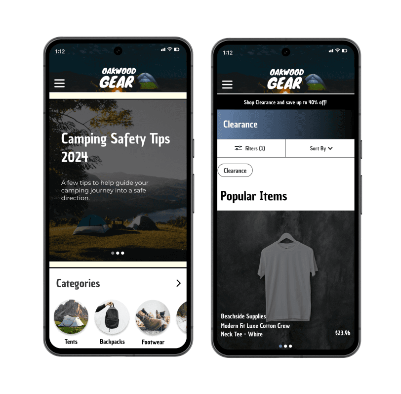
I created a platform for Oakwood Gear that enables users to order camping supplies. Additionally, I incorporated a safety guide into the app to educate users on maintaining safety during their outdoor adventures.
My role
Full UX/UI Design Process
User Research
Animations


Project Overview
I created a platform for Oakwood Gear that enables users to order camping supplies. Additionally, I incorporated a safety guide into the app to educate users on maintaining safety during their outdoor adventures.
My role
Full UX/UI Design Process
User Research
Animations


Competitive Analysis
I had to review my competitors' designs to generate ideas for the app. Analyzing their navigation and distinctive features was crucial in this audit. Below are some observations I made.
Common Competitors





Common Practices of Competitors
Allows users to sort and filter content
Often includes a safety guide
Allows users to choose from multiple categories
Includes login details, saved checkout details, and often times transaction history
Target Goals
Allow users to sort and filter content
Educate users on safety related topics
Allows users to find key information (login, homepage, categories, etc.)
List of Competitors

REI Co-op
REI Co-op is a large outdoor gear chain brand. They offer quality and innovation and a lower price than many other chain brands.


Scheels
Sporting goods and entertainment chain brand. They stock world-class brands and are known for their wide-range of sports gear.


Backcountry
Large online specialty retailer for outdoor gear and clothing, from big brands, to the small and undiscovered.


Koa
An american franchise of privately owned campgrounds. Having more than 500 locatons across the United States and Canada.
Project Overview
I created a platform for Oakwood Gear that enables users to order camping supplies. Additionally, I incorporated a safety guide into the app to educate users on maintaining safety during their outdoor adventures.
My role
Full UX/UI Design Process
User Research
Animations

Users want to preview products online before making a purchase.
Many customers prefer to check a company's product availability to avoid an unnecessary trip to the store.
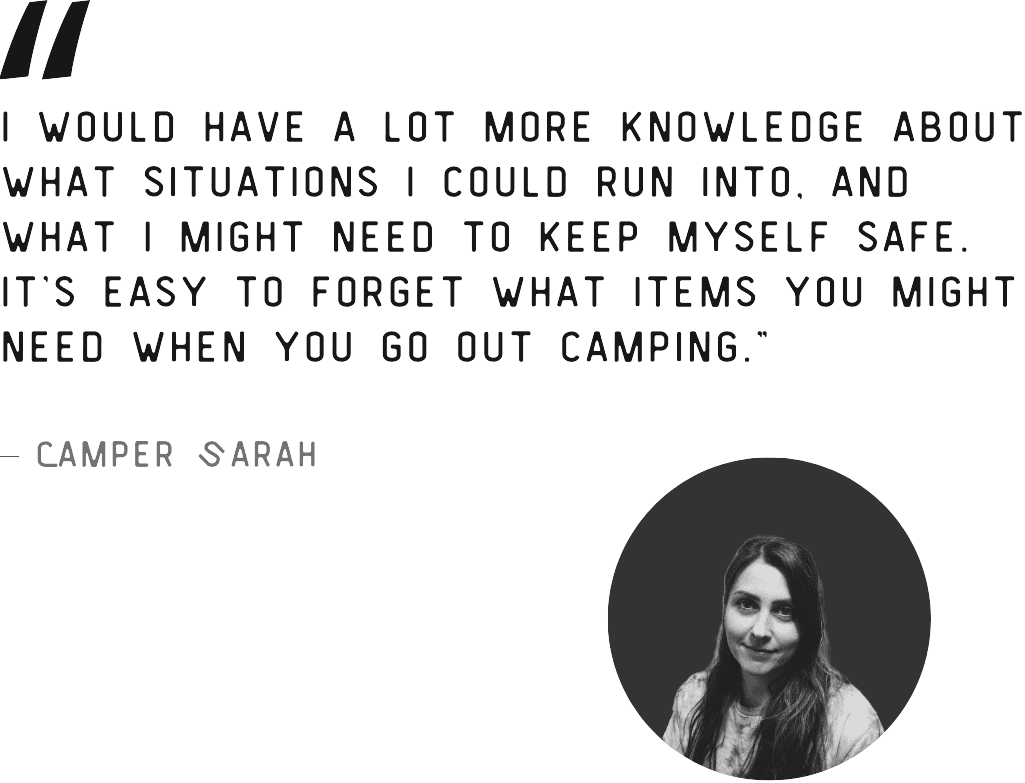
Users often need to research what items to take camping. A platform that offers information on the subject while also providing a means to purchase supplies would be more convenient and enhance the process.
Studies indicate that over 81% of the U.S. population engages in online shopping, a trend that is growing in popularity.
There is too much research involved in going camping.
Users tend to prefer online shopping.


I had to review my competitors' designs to generate ideas for the app. Analyzing their navigation and distinctive features was crucial in this audit. Below are some observations I made.
I had to review my competitors' designs to generate ideas for the app. Analyzing their navigation and distinctive features was crucial in this audit. Below are some observations I made.
Common Competitors


Competitive Analysis









Common Practices of Competitors
Allows users to sort and filter content
Often includes a safety guide
Allows users to choose from multiple categories
Includes login details, saved checkout details, and often times transaction history
Target Goals
Allow users to sort and filter content
Educate users on safety related topics
Allows users to find key information (login, homepage, categories, etc.)
Common Competitors


Common Competitors


List of Competitors

REI Co-op
REI Co-op is a large outdoor gear chain brand. They offer quality and innovation and a lower price than many other chain brands.

Scheels
Sporting goods and entertainment chain brand. They stock world-class brands and are known for their wide-range of sports gear.



An american franchise of privately owned campgrounds. Having more than 500 locatons across the United States and Canada.
Koa
Large online specialty retailer for outdoor gear and clothing, from big brands, to the small and undiscovered.
Backcountry
List of Competitors

REI Co-op
REI Co-op is a large outdoor gear chain brand. They offer quality and innovation and a lower price than many other chain brands.

Scheels
Sporting goods and entertainment chain brand. They stock world-class brands and are known for their wide-range of sports gear.

Backcountry
Large online specialty retailer for outdoor gear and clothing, from big brands, to the small and undiscovered.

Koa
An american franchise of privately owned campgrounds. Having more than 500 locatons across the United States and Canada.
The primary user group identified through research comprises individuals who enjoy camping and other outdoor activities, frequent online shoppers, and those who prioritize safety. My goal was to understand how users would find the app beneficial and to concentrate on that aspect. It was essential to create an application that users would find enjoyable and efficient. Below are several key insights gathered from my user interviews:
The primary user group identified through research comprises individuals who enjoy camping and other outdoor activities, frequent online shoppers, and those who prioritize safety. My goal was to understand how users would find the app beneficial and to concentrate on that aspect. It was essential to create an application that users would find enjoyable and efficient. Below are several key insights gathered from my user interviews:
Insights from User Interviews


Users want to preview products online before making a purchase.
Many customers prefer to check a company's product availability to avoid an unnecessary trip to the store.


There is too much research involved in going camping.
Users often need to research what items to take camping. A platform that offers information on the subject while also providing a means to purchase supplies would be more convenient and enhance the process.


Users tend to prefer online shopping.
Studies indicate that over 81% of the U.S. population engages in online shopping, a trend that is growing in popularity.

The Oakdoor Gear mobile app will enable users to purchase camping supplies online and provide them with a basic safety guide. This will benefit regular campers by helping them enjoy a comfortable and safe camping experience.
Goal Statement



The Oakdoor Gear mobile app will enable users to purchase camping supplies online and provide them with a basic safety guide. This will benefit regular campers by helping them enjoy a comfortable and safe camping experience.
Goal Statement


The Oakdoor Gear mobile app will enable users to purchase camping supplies online and provide them with a basic safety guide. This will benefit regular campers by helping them enjoy a comfortable and safe camping experience.
Goal Statement


Ideation Sketches
Digital Wireframes
Testing Low-fi Designs
High Fidelity
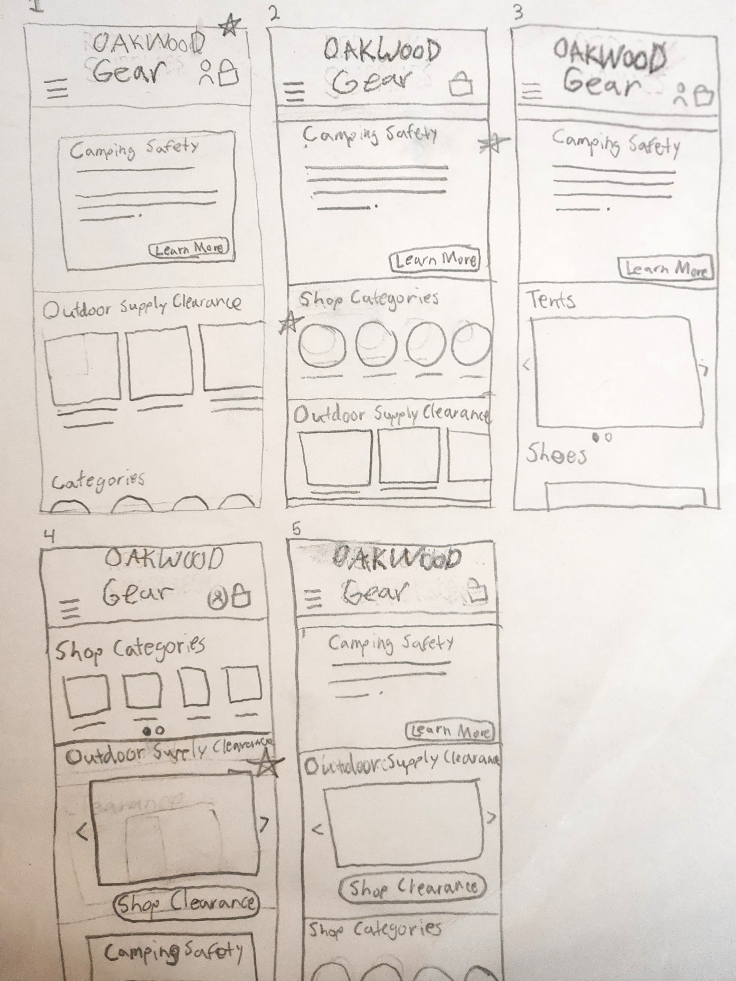
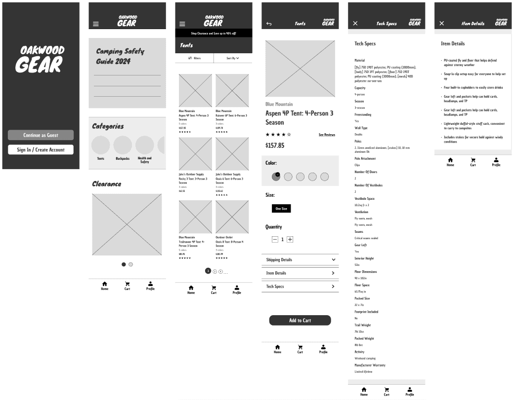
As I started sketching the paper wireframes, I considered the app's purpose, which guided my decisions on the home screen's content. It was crucial to incorporate navigation and the app's primary features. To visualize the end product, I added icons and buttons.
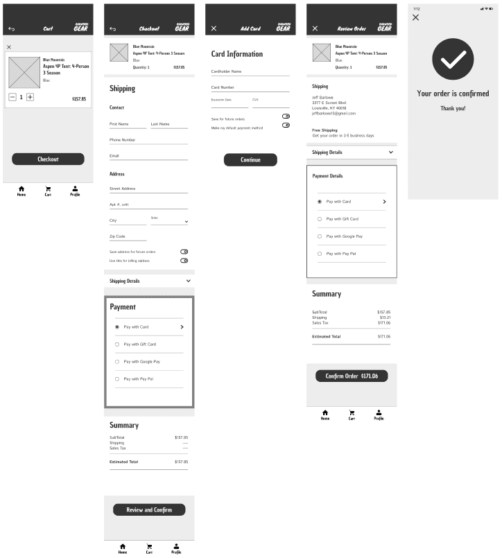
I integrated the main functions of the mobile app into the home screen, including options for ordering camping supplies and accessing the 2024 camping safety guide. As I designed the app, I made sure to leverage my research effectively. I transformed my wireframes into low-fidelity prototypes by creating connections between them.
I carried out a usability study with five participants. Each participant was experienced with online shopping and had made similar purchases before. The study provided me with valuable insights that will guide the modifications needed to enhance my app's usability and meet user requirements.
Camper Mike mentioned that some people might want to know a tent's dimensions before purchasing it. This inspired me to include an "Info and Specs" section in my mobile app to provide users with more details about specific products, a feature I've seen in other apps during my research. Fellow UX designer and camper Sarah, offered valuable insights in this usability study. She recommended that the splash screen should allow users to continue as guests, eliminating the need for them to log in or create an account.
Before
After
Key Takeaways



Incorporate "Information and Specifications" to provide users with more details about the item.
Added the “Shipping Details”, “Item Details”, and “Tech Specs” section to present essential information on each item.
Moved the categories above the clearance section on the homepage to show hierarchy importance of that section.
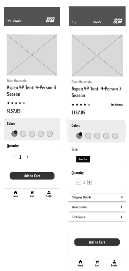
The "Shipping Details," "Item Details," and "Tech Specs" dropdown menus have been added to provide essential information for each item.
Center "tents" on the top navigation bar to indicate the current screen without causing confusion.
Applied Updates
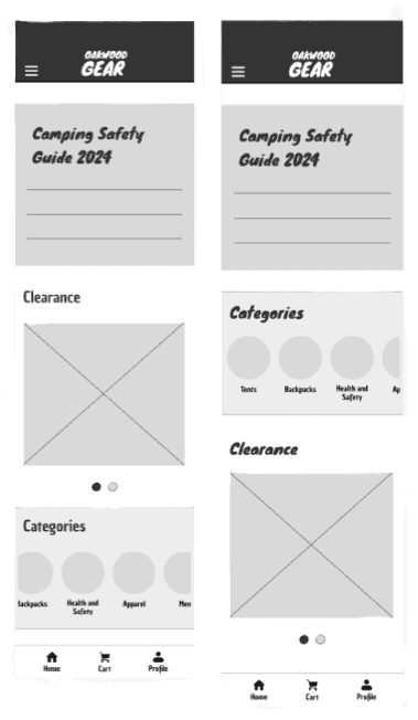
Moved the categories above the clearance section on the homepage to show hierarchy importance of that section.
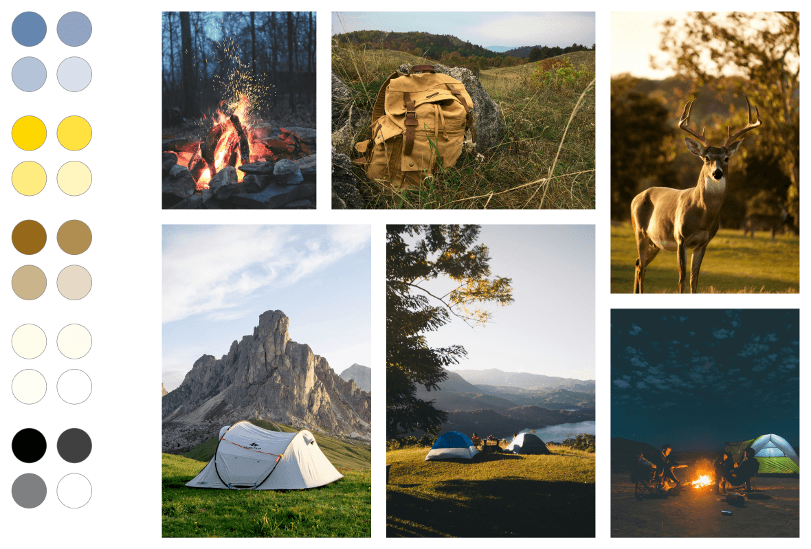
I've developed a mood board to capture the essence of my design and the atmosphere conveyed by the app
Rural Authentic Sterling Cozy
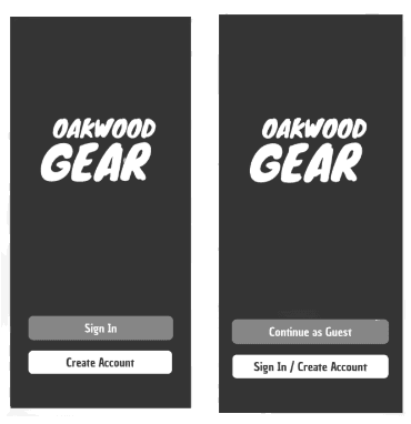
Introduced a "Continue as Guest" feature to enable users to access the app without the need to sign up or log in.
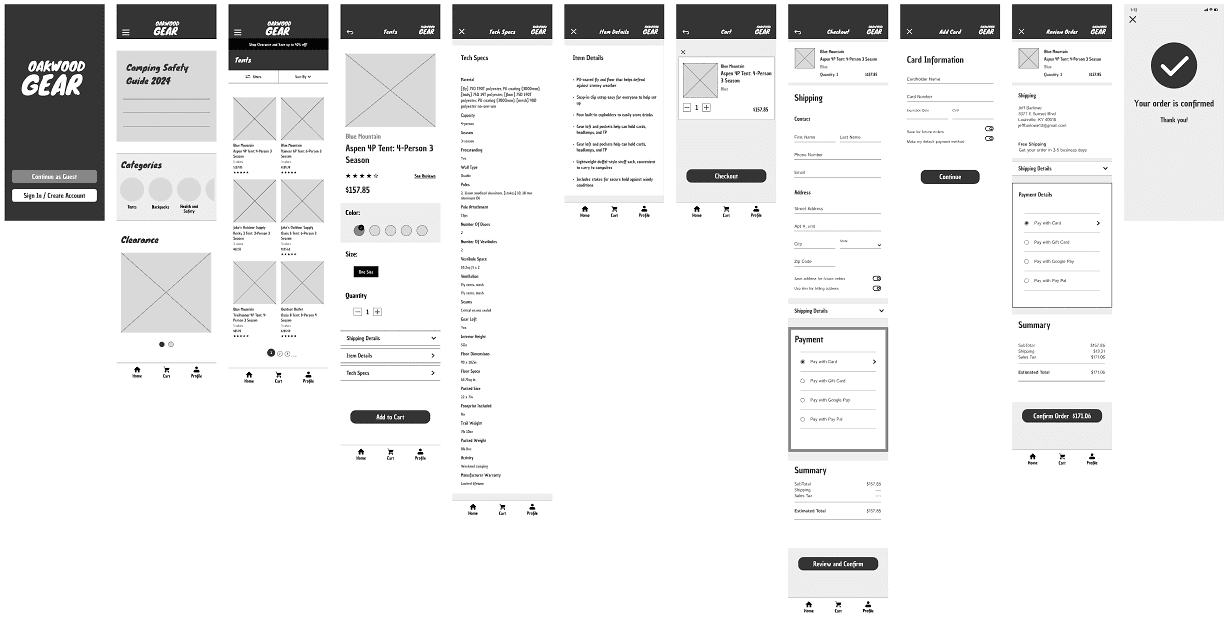
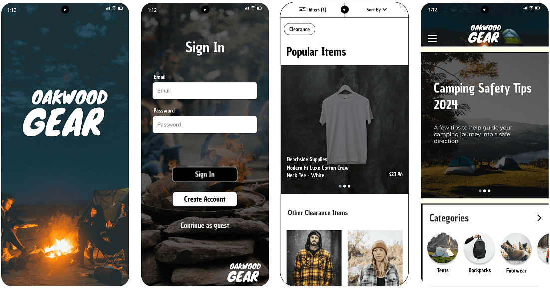
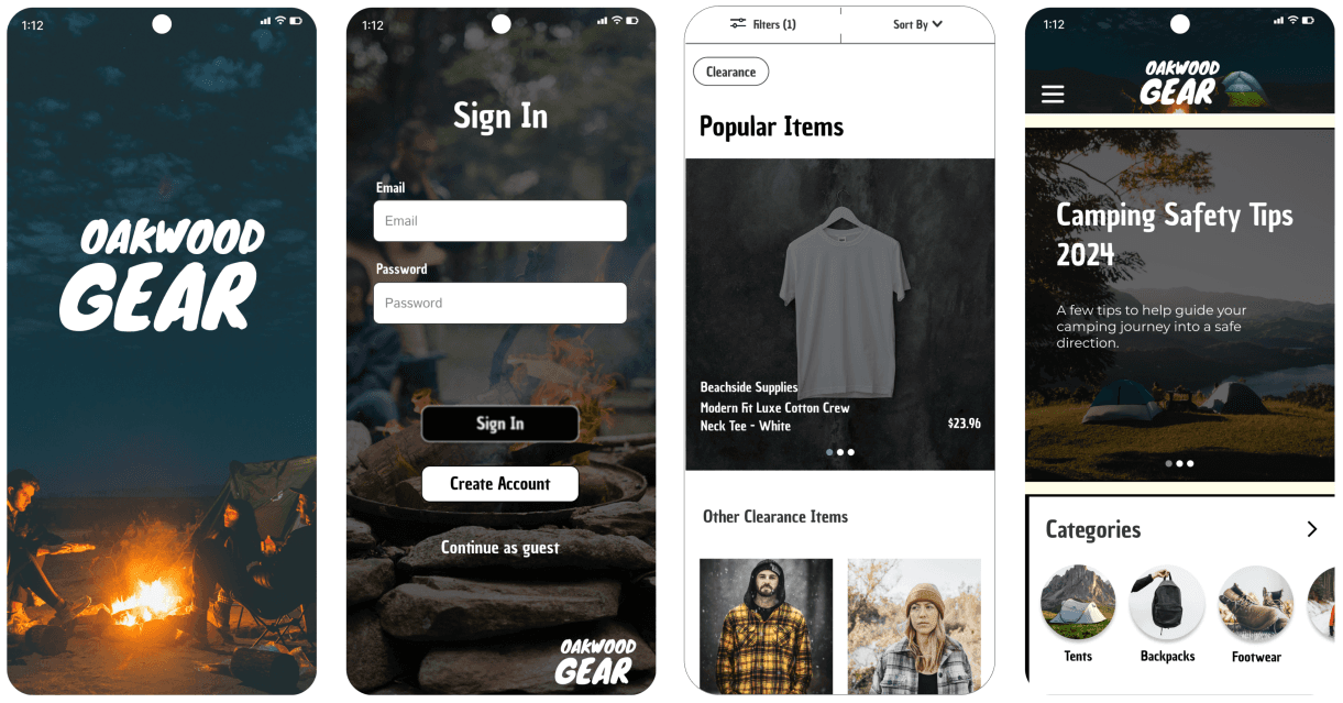
As I moved to the high-fidelity prototype phase, incorporating visual identity into my designs became essential. I selected a color palette, defined text styles, and chose images that aligned with the app's nature theme, reflecting its focus on ordering camping supplies. To complete the high-fidelity prototype, I also integrated several animations, and made connections to make my design interactive.
Visual Identity
High Fidelity Prototype
View Mobile App


Ideation Sketches
Digital Wireframes
Testing Low-fi Designs
High Fidelity


As I started sketching the paper wireframes, I considered the app's purpose, which guided my decisions on the home screen's content. It was crucial to incorporate navigation and the app's primary features. To visualize the end product, I added icons and buttons.
I integrated the main functions of the mobile app into the home screen, including options for ordering camping supplies and accessing the 2024 camping safety guide. As I designed the app, I made sure to leverage my research effectively. I transformed my wireframes into low-fidelity prototypes by creating connections between them.
I carried out a usability study with five participants. Each participant was experienced with online shopping and had made similar purchases before. The study provided me with valuable insights that will guide the modifications needed to enhance my app's usability and meet user requirements.


The "Shipping Details," "Item Details," and "Tech Specs" dropdown menus have been added to provide essential information for each item.
The "Shipping Details," "Item Details," and "Tech Specs" dropdown menus have been added to provide essential information for each item.


Moved the categories above the clearance section on the homepage to show hierarchy importance of that section.
Moved the categories above the clearance section on the homepage to show hierarchy importance of that section.


Introduced a "Continue as Guest" feature to enable users to access the app without the need to sign up or log in.
Introduced a "Continue as Guest" feature to enable users to access the app without the need to sign up or log in.
As I moved to the high-fidelity prototype phase, incorporating visual identity into my designs became essential. I selected a color palette, defined text styles, and chose images that aligned with the app's nature theme, reflecting its focus on ordering camping supplies. To complete the high-fidelity prototype, I also integrated several animations, and made connections to make my design interactive.
High Fidelity Prototype


View Mobile App
Camper Mike mentioned that some people might want to know a tent's dimensions before purchasing it. This inspired me to include an "Info and Specs" section in my mobile app to provide users with more details about specific products, a feature I've seen in other apps during my research. Fellow UX designer and camper Sarah, offered valuable insights in this usability study. She recommended that the splash screen should allow users to continue as guests, eliminating the need for them to log in or create an account.
I've developed a mood board to capture the essence of my design and the atmosphere conveyed by the app
Rural Authentic Sterling Cozy
Visual Identity


Center "tents" on the top navigation bar to indicate the current screen without causing confusion.
Center "tents" on the top navigation bar to indicate the current screen without causing confusion.
Key Takeaways


Incorporate "Information and Specifications" to provide users with more details about the item.
Added the “Shipping Details”, “Item Details”, and “Tech Specs” section to present essential information on each item.
Moved the categories above the clearance section on the homepage to show hierarchy importance of that section.
Applied Updates
Before
After


Ideation Sketches
Digital Wireframes
Testing Low-fi Designs


As I started sketching the paper wireframes, I considered the app's purpose, which guided my decisions on the home screen's content. It was crucial to incorporate navigation and the app's primary features. To visualize the end product, I added icons and buttons.
I integrated the main functions of the mobile app into the home screen, including options for ordering camping supplies and accessing the 2024 camping safety guide. As I designed the app, I made sure to leverage my research effectively. I transformed my wireframes into low-fidelity prototypes by creating connections between them.



Moved the categories above the clearance section on the homepage to show hierarchy importance of that section.
Moved the categories above the clearance section on the homepage to show hierarchy importance of that section.
Introduced a "Continue as Guest" feature to enable users to access the app without the need to sign up or log in.
Introduced a "Continue as Guest" feature to enable users to access the app without the need to sign up or log in.
After


Camper Mike mentioned that some people might want to know a tent's dimensions before purchasing it. This inspired me to include an "Info and Specs" section in my mobile app to provide users with more details about specific products, a feature I've seen in other apps during my research. Fellow UX designer and camper Sarah, offered valuable insights in this usability study. She recommended that the splash screen should allow users to continue as guests, eliminating the need for them to log in or create an account.


Key Takeaways
Incorporate "Information and Specifications" to provide users with more details about the item.
Added the “Shipping Details”, “Item Details”, and “Tech Specs” section to present essential information on each item.
Moved the categories above the clearance section on the homepage to show hierarchy importance of that section.





High Fidelity


Moved the categories above the clearance section on the homepage to show hierarchy importance of that section.
Moved the categories above the clearance section on the homepage to show hierarchy importance of that section.
Introduced a "Continue as Guest" feature to enable users to access the app without the need to sign up or log in.
Introduced a "Continue as Guest" feature to enable users to access the app without the need to sign up or log in.


As I moved to the high-fidelity prototype phase, incorporating visual identity into my designs became essential. I selected a color palette, defined text styles, and chose images that aligned with the app's nature theme, reflecting its focus on ordering camping supplies. To complete the high-fidelity prototype, I also integrated several animations, and made connections to make my design interactive.
Applied Updates


Visual Identity
I've developed a mood board to capture the essence of my design and the atmosphere conveyed by the app
Rural Authentic Sterling Cozy


High Fidelity Prototype

View Mobile App


Introduced a "Continue as Guest" feature to enable users to access the app without the need to sign up or log in.
Introduced a "Continue as Guest" feature to enable users to access the app without the need to sign up or log in.
The "Shipping Details," "Item Details," and "Tech Specs" dropdown menus have been added to provide essential information for each item.
The "Shipping Details," "Item Details," and "Tech Specs" dropdown menus have been added to provide essential information for each item.
Center "tents" on the top navigation bar to indicate the current screen without causing confusion.
Center "tents" on the top navigation bar to indicate the current screen without causing confusion.
Moved the categories above the clearance section on the homepage to show hierarchy importance of that section.
Moved the categories above the clearance section on the homepage to show hierarchy importance of that section.
Before
After


jessebishop04@gmail.com
Let's Work
TOGETHER!


